A very important feature request regarding restore experience:
Both, currently released UI and Beta Web UI in the Restore workflow force me to first select revision, and then browse to the file or folder I want to restore. This is not how human brain works. Virtually any time I want to restore something I definitely know what object I want restore but I’m often not sure which version of it do I need.
Therefore it is way more natural to first select an object and then select revision.
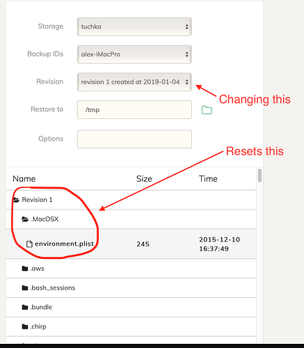
Presently, once I select revision and navigate to a file, and then realize that this was not the revision I wanted to restore – I can chose different one; but my path to the object is reset and I have to browse to that same objet again. This is highly annoying. This violates a very important UX principle - never lose data user created and inpu.
What I expect as a minimum: once I browsed to a specific file at certain revision, but then changed selected revision in the combo box above - my location in the hierarchy shall be preserved, as much as possible. I should not be forced to browse to the same file again.
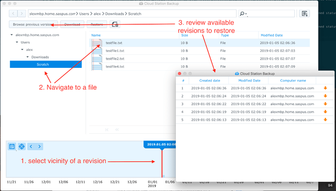
Optimally, I would like to be able to browse for a file or folder, and then list all available revisions of that file or folder, with ability to QuickView known types of documents, and then select which one I want to restore.
This is a very important use case which for some reason vast majority of backup tools ignore, with very rare exceptions.
EXAMPLES:
-
Bad behavior: Restore workflow in the current web-ui beta:
-
Good behavior (with the room for improvement in the flow, but functionality is there): Version Explorer in Synology Cloud Station Backup


