It is hard to see where the cursor is in your gif, but did you click the folder icon next to the directory name? Clicking on the directory name will only select the directory (thus the select button turns enabled).
The Windows version is now available. I added the link to the first post.
Comments so far, fwiw:
- 8080 is way too common. Please default to different port that likely nobody else is using.
- MacOS: SFTP Storage, path to key file shall understand
~ - MacOS: SFTP Storage, path to key file browser shall show hidden files
- After adding storage, the message “Run a check job to retrieve stats” appears but it is not indicated in any way how exactly this needs to be accomplished.
- Include/Exclude patten editor shall allow to add a list of exclusions, not one-by-one. Use case - copy-paste exclusion list from the existing duplicacy
- Restore button is way too small and the icon misleading; in addition it is dangerously close to the button that deletes the backup task. Those are opposite actions and shall not be physically close.
- It shall be possible to edit storage after creating it.
- Pressing teal triangle in the schedules section after creating a backup schedule for SFTP target results in nothing - text changes to Running briefly and then to “next run in …”. The backup seem to fail, but nothing in the logs
- Run backup button in the schedules section is way too small
- It shall be possible to run backup from the Backup sections, without the need to create a schedule.
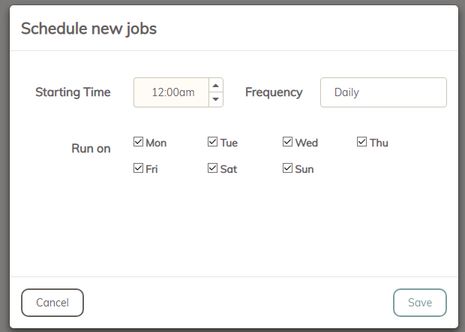
- [bug] when adding second job to the schedule the first job disappeared. (had backup job, added check job, the backup job disappeared)
I do realized that it’s way too early, but just leaving this here in case something of this is not yet known.
Ok, I’ll show myself out now.
Could you please put a .exe at the end of the windows executable for us, windows peasants? 

Sidenote: it’s interesting to see that there are more mac users than windows xD.
Hello, I’m blown away with new web gui, finally we can create super useful schedules with check and copy - I really love it
My findings:
-
The
RevisionsandChunkstabs in theStoragessection dont work if storage name have space in name. I have to delete and recreate storage to make it work. -
GUI ux is bit confusing. For example plus (+) button for Backups is on the top of the page. For Storage and Schedules, plus button is on bottom of the page.
-
Clickable status on Schedule page for every job is not intuitive - it does not seem clickable. Maybe there is a need for a hover effect (like for Options when if i hover mouse on it, it’s change)

-
I cant write number is schedule time - i can only select it by arrows - but that’s a detail
-
Schedules names are not displayed on dashboard page
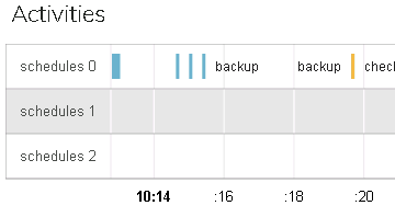
It’s possible to create schedule and disable all days - I really like that.
I think I’m not realizing something obvious …
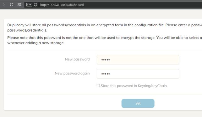
I can’t go through the login screen, either with a new password or even without a password. The “set” button does not become enabled:
Thanks! Worked!
Another important location for a mouse over hint…
I added without any problems one of my storages in B2:
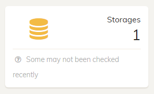
But:

I haven’t found how to perform a check, or even schedule a job with this command, only:
Ah, I understood now, I must create a job and configure the job commands …
- It would be nice to be able to manually execute the commands without having to setup a scheduled job.
I agree!
- Another point: you can not edit the commands that are part of a schedule, just delete them (although you can click “options” and edit them).
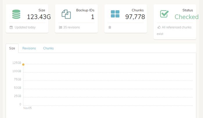
I thought that by running check, it would recover the size of all backup revisions (something equivalent to the tabular output), and not only the last one:
-
Needs some fine adjustments in the size of the squares above, texts are “coming out”, probably an automatic adjustment of object size.
-
The log files should have in the name not only the command and the date, but also the name of the storage.
Nice work so far!
I think I must be doing something really dumb but I’m trying the Windows version and I keep getting “invalid token” when trying to set the initial password. Any ideas?
You’re right. I didn’t think to click on the icon. FWIW I was expecting a double click to expand the directory (and single-click to select), but you can probably file this under stupid end user error if it’s obvious to others.
Not sure which other port should be used.
Will fix these.
I think it just needs to be explained in the user guide with the official release.
Agreed.
Don’t know if there is a better place for the restore buttion.
Not sure about this.
Was there any error in ~/.duplicacy-web/logs/duplicacy_web.log? Or was there a new log file named backup-yyyymmdd-hhmmss.log under the same directory?
The bottom of the backup panel is reserved for that.
Can you reproduce this? Don’t know how this can happen.
I’ll fix that.
That is because backups are per computer. Later you should be able to add remote computers and create backups for each of them.
This can be easily fixed by some CSS changes.
Currently schedules do not have names. Maybe they should?
This can be very convenient, this I total agree, but I need to think about the details.
The size is the total bytes of chunks on the storage (including all revisions).
This can be easily fixed.
The names of the log files aren’t that important. I hope to make a better version of the Activities panel in the Dashboard page from where you can access all the logs.
Try reload the page before entering the password. You probably accessed the page from different machines at different times (or restart the binary after the page was generated).
As a suggestion - port 3875. It is not widely used and the number is a T9 for DUPL 
Objects that are more frequently used should be larger and easier to click, more affordable. backup and restore are a safe buttons to click, while deleting the backup task is not --and yet they are all very small crowding in the corner. but I’m not an expert in UI design, there perhaps are better approaches.
Ive tried to re-create the scenario after nuking rm -rf ~/.duplicacy-web/.
But now I cannot add SFTP storage anymore - when putting all data I get this error:
2018/11/05 22:26:35 ERROR STORAGE_CREATE Failed to load the SFTP storage at sftp://me@nas.home.saspus.com//Backups/duplicacy: ssh: handshake failed: open /Users/me/.duplicacy-web/repositories/localhost/all/.duplicacy/known_hosts: no such file or directory
There is nothing under ~/.duplicacy-web/repositories/localhost/all
Perhaps it is a simplistic approach, but thinking about hierarchy:
- a job is made up of: command + parameters + options
- a schedule is made up of jobs
It may make more sense to create the jobs and then create schedules for these jobs. Or you can also have the option to run the jobs manually.
In this way, it would have a “jobs panel” and another “schedules panel” for the schedules of these jobs, where the schedules would be created and would simply point to one or more jobs already registered. You could even use a job in more than one schedule.
I said this because I was enthusiastic about this chart in the other post about the interface: 
I thought I could see the growth of backups considering the revisions already created.

