Increase the post width

I think that discourse post width is a little bit too narrow.

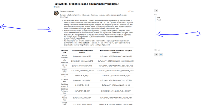
See the table here for example: Passwords, credentials and environment variables, where i have to scroll sideways to read it all.

Also: see how much empty space i have on my 16:10 screen:

Do you think it would be a good idea to make a theme component which increases the width of the posts in #how-to?

I don’t think it’s a good idea because it is likely to mess up all kinds of things in the overall design of the forum. Both technically and visually but especially visually. As you probably know, it’s much easier to read text with limited width (hence the column layout in newspapers and magazines) and if you make the column wider for the tables, you pay for it with every line of text you read. I don’t think that’s worth it. Personally, I find that table in that post perfectly fine to read. Given it’s nature, there is no need to get an overview of the whole table.

1 Like

A lot of fair points.

Knew I’d seen this topic before. (Bump! :slight_smile: )

As I just highlighted here, that particular post is a pita to read properly. If we don’t want a wider layout for #how-to, maybe the table could be reformatted? Say, mulit-line entries, to keep the width non-scrollable in desktop view at least.

A little test…

password type environment variable key in preferences
storage password DUPLICACY_PASSWORD or DUPLICACY_<STORAGENAME>_PASSWORD password
sftp password DUPLICACY_SSH_PASSWORD or DUPLICACY_<STORAGENAME>_SSH_PASSWORD ssh_password
sftp key file DUPLICACY_SSH_KEY_FILE or DUPLICACY_<STORAGENAME>_SSH_KEY_FILE ssh_key_file
Dropbox Token DUPLICACY_DROPBOX_TOKEN or DUPLICACY_<STORAGENAME>>_DROPBOX_TOKEN dropbox_token
S3 Access ID DUPLICACY_S3_ID or DUPLICACY_<STORAGENAME>_S3_ID s3_id
S3 Secret Key DUPLICACY_S3_SECRET or DUPLICACY_<STORAGENAME>_S3_SECRET s3_secret
BackBlaze Account ID DUPLICACY_B2_ID or DUPLICACY_<STORAGENAME>_B2_ID b2_id
Backblaze Application Key DUPLICACY_B2_KEY or DUPLICACY_<STORAGENAME>_B2_KEY b2_key
Azure Access Key DUPLICACY_AZURE_KEY or DUPLICACY_<STORAGENAME>_AZURE_KEY azure_key
Google Drive Token File DUPLICACY_GCD_TOKEN or DUPLICACY_<STORAGENAME>_GCD_TOKEN gcd_token
Google Cloud Storage Token File DUPLICACY_GCS_TOKEN or DUPLICACY_<STORAGENAME>_GCS_TOKEN gcs_token
Microsoft OneDrive Token File DUPLICACY_ONE_TOKEN or DUPLICACY_<STORAGENAME>_ONE_TOKEN one_token
Hubic Token File DUPLICACY_HUBIC_TOKEN or DUPLICACY_<STORAGENAME>_HUBIC_TOKEN hubic_token
Wasabi Key DUPLICACY_WASABI_KEY or DUPLICACY_<STORAGENAME>_WASABI_KEY wasabi_key
Wasabi Secret DUPLICACY_WASABI_SECRET or DUPLICACY_<STORAGENAME>_WASABI_SECRET wasabi_secret
webdav password DUPLICACY_WEBDAV_PASSWORD or DUPLICACY_<STORAGENAME>_WEBDAV_PASSWORD webdav_password

Note the cleanest, but at least the last column won’t be missed.

I’m more curious if i can make a custom theme which only addresses that specific post, to make it wider.

To alleviate this in the short term, i just added a message asking the user to scroll sideways!

I have done a few changes to that specific post:

  • widen it a little bit
  • decrease font for the table
  • move everything a bit to the left

Not beautiful, but not that ugly either.

2 Likes