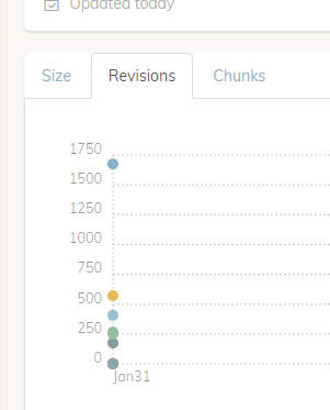
Okay, that makes sense. To be more precise: it makes sense that we can’t extrapolate the total storage that was used in the past from today’s data. But the size of individual revisions (snapshots?) doesn’t change, right? So it should be quite possible to show how the size of a snapshot (backup?) developed over time, based on current data. The only thing that will change if revisions are deleted is the resolution of the graph (i.e. there will be fewer data points) but the data points themselves will always be accurate, right?
I think it would be valuable to have this kund of graph.
Now back to the total storage size, which is, of course, also valuable to see but as you rightly point out, we cannot pretend that what we get from a current check command is an accurate representation of actual storage size historically. Thus, it should not be the same graph. But wouldn’t it make sense to show this data in a separate graph (or rather: a separate line in the same graph)?
Reason 1: If you don’t have “real” historial data, it is better than nothing. (And if you never pruned, it is even accurate.)
Reason 2: If you do have “real” historical data, the second line (based on current data) will give you a nice comparison to see the effects of pruning.
And I guess @Droolio is offering a third reason (de-duplication efficiency) that I hadn’t thought of:
Or, well, as I think about it that seems to be yet another graph. In any case, the bottom line is: