The new website is nice :) + feedback

I have some remarks about it though, @gchen :

I would argue that having all the buttons visible at all times will look really good.

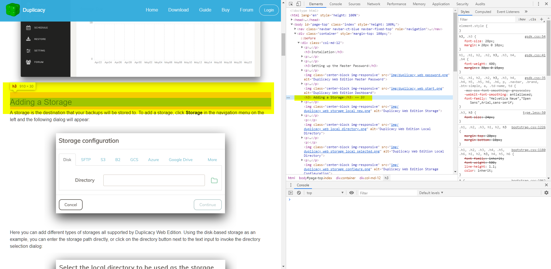
Plus it’s also weird when moving from one page to the other that the buttons, their positions and their colors change, see

See how all the buttons move to the right when entering “Guide”, but move to the left when entering “Buy”.

I found that to be confusing. Because i expect the navbar to be stable static. If i found that confusing i’m thinking that other people can find it even more so.

Ah! I had noticed something strange in navigation, and had not realized what it was :smile:

The new site has a couple of minor issues on mobile: Firefox and Safari on iOS to be specific (and maybe others).

  1. The top “A new generation…” section gets cut off well before the download button (not that downloading on mobile is super useful, but the words are cut off too)

  2. The hamburger menu won’t stay expanded long enough to click on anything

edit: added example

Second feedback:

It would be useful if at least the :d: Guide would have a way to get anchors so that we could easily link to specific parts of the guide, instead of making someone scroll through the whole page and find exactly what we meant.

For example i just needed this in Dropbox storage with web 1.0 Interface.

See an example of what i want here (ignore the TOC on the right please, i’m just interested in having the anchor # on the title)


Here’s just a mockup:

h3:hover:after {    content:" #"; }


And you’d have to add an “onclick” which either copies the link to clipboard(to be really fancy), or just add the add the anchor to the whole h3 tag, so the browser shows the address automatically, and then everybody can copy it.

2 Likes