
I have a number of backups where one of them takes up the majority of the backup.
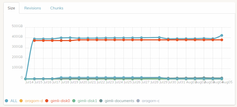
As you can see, it’s sort of difficult to tell exactly how much storage each individual backup takes up.
Red is leading the way with roughly 400GB, but everything else is crammed in the bottom and you can’t even tell them apart. All in all, it’s not that useful other than to see how vastly different these backups are.
So: There’s no way to tell/see how much storage/revisions/chunks the smaller ones use, and there’s no real way to see the delta per day other than negligible bumps.
I’m proposing the following features:
- Allow the graph to be zoomed similar to the dashboard logs timeline. This would let you see tens of gigabytes, and ones of gigabytes on the scale as well as seperating the gaps between lines.
- Allow the display of certain backups to be turned on and off, scaling the graph accordingly. Disabling “all” and “gimli-disk0” should drop the graph on a scale close to 1-40 giving a better visual indication of their differences.
- If possible, display the stats for each backup independently