Web UI 1.0.0 chart usability enhancements

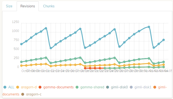
The charts in v1.0.0 of the web UI offer an okay high-level view, but they are missing some features that I think would make them much more useful. Here’s an example for reference.

(Probably obvious, but for clarity) Note that I’ve obfuscated the backup names with black boxes and those aren’t a part of how the graphs actually look for me.

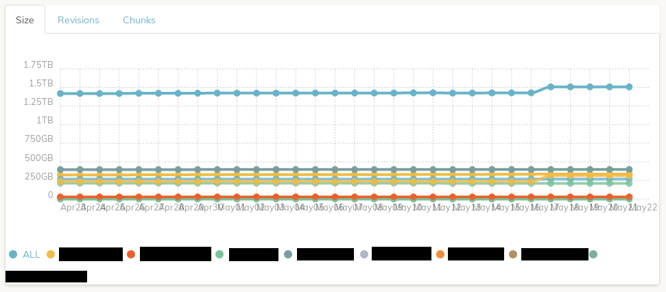
The charts seem to be based on Chartist, so maybe the options to improve usability without switching to something like d3 or c3 might be limited or difficult to implement.

Suggested enhancements:

  1. legend entries / lines can be toggled on and off. Currently, the ALL line crushes all of the individual backups. I’d like to be able to show only one line, or maybe a subset of lines. It’s also nearly impossible for me to distinguish individual lines due to proximity and how similar some of the colors are.

  2. tooltips display for all series for a hovered date, or maybe just for a hovered data point. It looks like Chartist has a tooltip plugin, but it might not be usable on its own without either #1 or the ability to zoom into the graph.

Chart bugs:

  1. legend entry wrapping doesn’t keep the marker and label together (see last legend entry in the screenshot above for an example)

  2. x-axis labels can overlap

9 Likes

Any chance any of these can make it into the web GUI roadmap?

legends

I found a chartist plugin that should address #1. It might also address #3, but I’m not sure.

Here’s a demo: chartist-plugin-legend examples

tooltips

Here’s a chartist plugin to show tooltips, though it looks like it needs some work.

https://gionkunz.github.io/chartist-js/plugins.html#tooltip-plugin

1 Like

I’ll do this for the next release. Thanks for the link to the plugin, which looks like exactly what I want.

3 Likes

Got an extra bug with the graph here:

Notice the colours - there’s 2 lines with the same green (all lines should be unique and differentiable), however in the key, there is only one item with that green colour. (the one with a low number of revisions that appears halfway along)

1 Like

Will this allow zooming out to see more history? It looks like it’s currently locked to a one month window. It’d be nice to be able to look back and see a wider view.

1 Like

Looks like this one didn’t end up making the cut for 1.2.0. Any chance it can make it into the next next release? :slightly_smiling_face:

Sorry it didn’t. This may require more work than thought, but I will make sure it will get into the next release.

2 Likes

Reliving the topic (because I’m having the same graph display problems as I set up more backups in the web version).

Suggestion: wouldn’t a filter field for the chart, which allows one or more selections (storage for the first graph and backup ID for the second), not solve these visualization problems?

1 Like