UI: Provide visual indication of include/exclude patterns on file tree

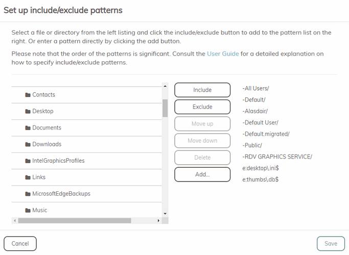
When setting up include/exclude patterns for backups, i’d love to see how the current rules apply to the files and folders visible in the panel.

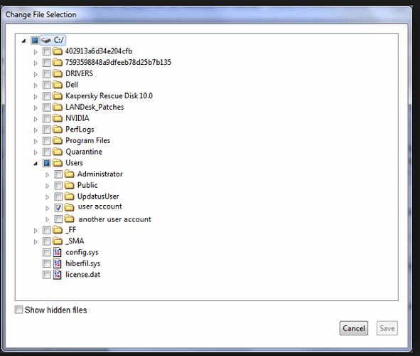
As you can see, there is no visual indication that the selected patterns apply to the folders that are in the tree. What i’d like to see, is after clicking exclude or include, the item in the tree gets a + or - icon next to it, similarly adding regex rules (for example for a file type), that this gets represented.

With the proposed way, we would have visual validation that our rules were applied correctly, as well as being able to see at a single glance, what will and won’t be backed up

Currently, it’s just a list editor :slight_smile:

Crashplan is nice in this way

3 Likes

I’d really like to be able to contribute to improve the UI in the variety of aspects like this that it’s lacking in.

EDIT:

Just to follow up, this issue caught me out soon after posting!
I had a rule set up to back up a single folder in a drive, and I was adding ignore rules for certain file types e.g. (thumbs.db) and because of adding this, rather than one small folder being backed up, the entire drive with applications/games and other large files started to back up!

If gone unnoticed this small change would have cost me a lot more money!
I’m not putting the blame on Duplicacy here as the documentation is there, but having this visualisation will dramatically help to catch silly mistakes which cause the difference between 1 file on a drive being backed up, and the whole drive except one file being backed up.

I couldn’t agree more. This is why I love FreeFileSync for complex operations. You can set up your filters, run a scan, and see exactly how your changes impact your file selection before executing it. You can even right-click on a folder or file and create a rule based on the name or path of the item you’ve selected right in the list of files.

Maybe I’m missing it, but I don’t see a real-time log in the Web UI like the desktop app used to have. It doesn’t even estimate the size of the selection you’re about to transfer to help catch issues like what the OP ran into. So now I feel completely blind setting up complicated rule combinations. At least with the log you could watch it go and catch something right away in the UI, stop, make changes, and repeat.

I’m hoping there’s something I’m missing that would help with this…

Looks like someone else posted something similar recently and it’s now on the roadmap
https://forum.duplicacy.com/t/roadmap-for-the-web-gui/2710/3

Would be really good if there’s an option, even if it is fairly slow to run, for this tick box stuff to show the result of regex patterns too.

2 Likes