Continuing the discussion from Restore UI Options - perhaps explicit selectors instead of an unforgiving edit field?:
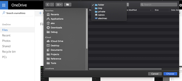
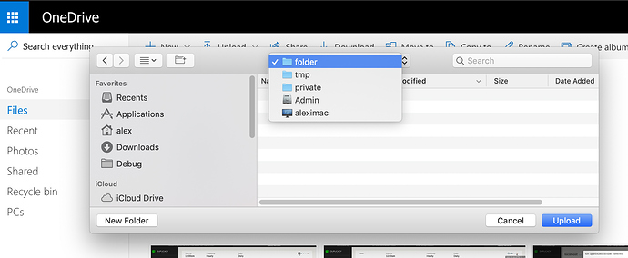
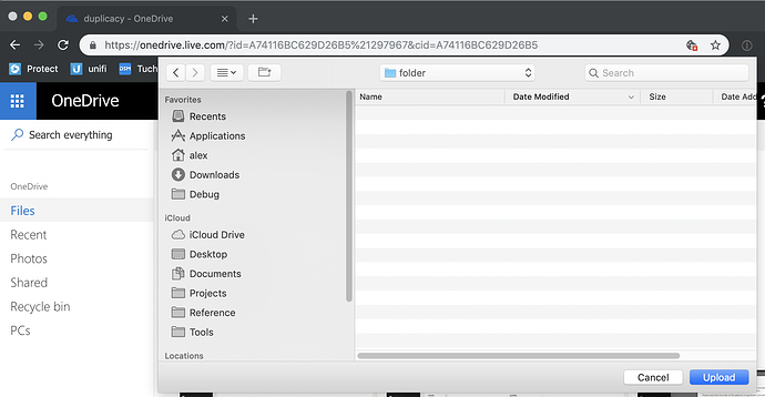
Example - Browse for a local destination dialog in the Restore workflow. The custom UI control looks cool for a first few seconds and then it becomes a source of constant frustration:
- All familiar gestures and shortcuts don’t work or work slightly differently. Moreover, those are different between OSes. (like dragging folder into open dialog on Windows copies contents there, and on macOS it just changes to that folder). It’s guaranteed to infuriate either one or the other set of users. Or force the developer to support different paradigms for different OSes, but why bother in the first place?
- It takes time to get used to it - do I click on an icon? on a title? Doublecklick? how do I enter directory? How do I paste path? Can I drag? I like dragging stuff around (especially in macOS you’d be surprised how much stuff is draggable onto how much other stuff).
- Developer will have to constantly maintain it in each OS separately to keep up with features and UI idioms. Support mounted drives? Support some interesting other feature that is in the new OS and that would have been free had the software just took advantage of the existing free file picker included in the OS? New OS update broke browsing in some cases? No, lets developers focus on duplicacy core functionality, not re-implementing file picker.
Now, one might argue that this was done for consistency across UI - after all, browse to a file in the revision history virtual file system looks exactly the same and perhaps it was not feasible to bolt custom virtual filesystem into standard file dialog.
There is an elegant solution to this. Which brings me to another linked topic below.


