This can be a useful feature but currently it is impossible. The GUI version was designed to write credentials only, and different jobs store their own credentials in different places so the GUI version can’t read credentials from one job and copy to another.
A few comments and issues, thanks again for keeping with the updates:
Log Panel
- Log is a bit weird, seems that the scroll doesn’t “stick” to the bottom, nor is the most recent log at the top of it. Would like to have either a way to sticky the scroll to the bottom, or reverse the order they are in (clicking the time column header doesn’t reorder).
- The log seems a bit short, would be nice to have a less “detailed” view with just errors, warnings, and key events in it with different row colors. When I copy the log, it only has the “packed” messages, which seem a bit verbose in my opinion.
3 Would be nice to have different colors (red for errors, yellow warnings, blue key operations, and white for packing commands and the such)
Usablilty
- I get an annoying error on chrome files complaining that it is locked by another process. I don’t think this should be an error that pops up unless the user really wants it, for now I think I will try to remove the folder that has the issue, but the popup could be nicer, or just a warning in the log messages.
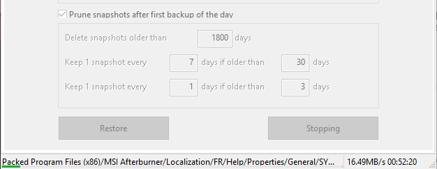
- When I click stop, it gets stuck on “stopping” and keeps packing the programs with the progress indicator going and acting like I didn’t event click the stop button. This was to a samba network drive.

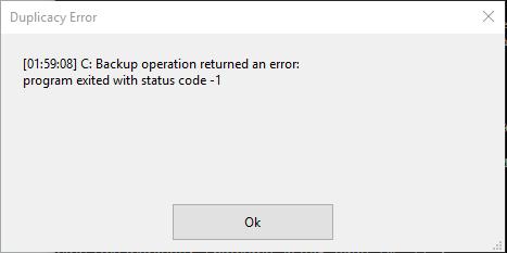
- When I click stop on backing up to a test ssh server I get a dialog that has a error code. I don’t think this is an actual error, but just something that is just caught incorrectly. I would expect if I press stop, that it would kill the backup process.

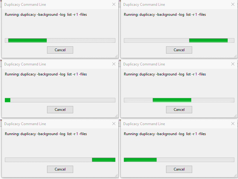
- When pressing the “list files” button in the restore menu, the animated progress bar doesn’t seem to be rendering smoothly, to me it looks like it gets hung up every half a second.

- Would like to have a “restore” and “restore to” button that will allow me to specify a folder. Even simpler would be a “restore to desktop” button so there isn’t another popup for browsing to that location.
- Not sure how this “list only these files work” it seems to not do anything for me. When I hit my enter key, it just does a restore of whatever file I have selected instead of filtering. I don’t see the list live updating, so not sure how the filtering gets applied (I would expect a live update, or a button to apply the filter to the current folder structure). After messing it a bit, it seems that it only gets applied if you re-list the files which queries the entire remote repository again, does not seem that ideal.
- When I press cancel from the “list files” dialog after having already performed a list files, the old folder listing disappears. Would be better to keep the old listing till a complete new file listing is downloaded, so all the API calls and transfers do not go to waste after a cancellation.
- For rate limit, it isn’t clear what units I can use, and what I should put in, units would be nice, or a drop down with different units or something of that sort.
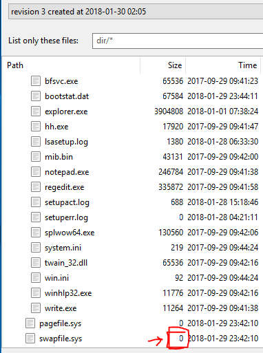
- Tables seem to have the first number/letter cut off, don’t know why though.
- Would be better to have the file size be human readable, pretty simple to just call some example functions out there.
Program Logic Flow
- I can select a repository that has a “.duplicacy” folder in it, and it will allow me to create a new job and change its parameters. I think this should not be allowed, and instead there should be a warning to either:
- If this directory is already a job, tell the user to edit it in that job tab and don’t allow them to create a new job.
- If this is not a job (so could be a old folder) warn the user that they are about to overwrite the old configuration and ask them if they want to proceed.
- Right now the default of just filling in the settings works for if the user wants to proceed with an OLD folder that isn’t a current job, but the schedule and pruning settings do not seem to sync on folder selection, so the only thing that is loaded is the repository and storage fields.
- Not sure if this is someplace I missed, but there needs to be a “start minimized” button, don’t know if it has changed since beta 4, but that is pretty key to just have this run in the background till needed.
- The restore menu, still seems to be clunky, one would expect the latest revision to be the default listing in the drop down, and there is little progress indication when it is listing files, would be nice to at least see a download speed, or the # of files left that need to be checked (I know that this is probably hard from a technical side, but for example when you make a revision you store the last total number of files that will need to be read when listing, and use this only for visualization / user feedback would work).
One feature that you have said isn’t supported is multiple backups for a single repository (e.g., my entire C drive can go to two different locations).
Looking at the github documents, I was wondering if this could be implemented as simply adding another backup location that will have the “copy” command performed for all additional locations that are not the primary.
Or for example, allow for multiple storage fields in a single job.
@goldbattle, you are the best user a developer can ask for! I’ll try to respond to most of your comments below:
Log is a bit weird, seems that the scroll doesn’t “stick” to the bottom, nor is the most recent log at the top of it. Would like to have either a way to sticky the scroll to the bottom, or reverse the order they are in (clicking the time column header doesn’t reorder).
I’ll make it stick to the bottom.
The log seems a bit short, would be nice to have a less “detailed” view with just errors, warnings, and key events in it with different row colors. When I copy the log, it only has the “packed” messages, which seem a bit verbose in my opinion. 3 Would be nice to have different colors (red for errors, yellow warnings, blue key operations, and white for packing commands and the such)
Currently the log window can only have 10K messages, otherwise it would consume too much memory. Yes, when it decides which log message to be removed from the log window, it should keep high-priority ones like errors and warnings. I’ll make the changes, but probably for a later version.
I get an annoying error on chrome files complaining that it is locked by another process. I don’t think this should be an error that pops up unless the user really wants it, for now I think I will try to remove the folder that has the issue, but the popup could be nicer, or just a warning in the log messages.
The CLI version handles this as an error because otherwise you may miss backing up an important file.
When I click stop, it gets stuck on “stopping” and keeps packing the programs with the progress indicator going and acting like I didn’t event click the stop button. This was to a samba network drive.
This is a bug. I’ll try to reproduce it.
When pressing the “list files” button in the restore menu, the animated progress bar doesn’t seem to be rendering smoothly, to me it looks like it gets hung up every half a second.
This is a limit of the wxWidgets library. I’m not sure if it can be easily fixed.
Would like to have a “restore” and “restore to” button that will allow me to specify a folder. Even simpler would be a “restore to desktop” button so there isn’t another popup for browsing to that location.
The CLI version does not have a -restore-to option for the restore command. This is mostly to avoid accidental overwriting files outside of the repository (which are less likely to be backed up).
Not sure how this “list only these files work” it seems to not do anything for me. When I hit my enter key, it just does a restore of whatever file I have selected instead of filtering. I don’t see the list live updating, so not sure how the filtering gets applied (I would expect a live update, or a button to apply the filter to the current folder structure). After messing it a bit, it seems that it only gets applied if you re-list the files which queries the entire remote repository again, does not seem that ideal.
The file list is actually cached on local disk (although a few lookups are still needed when you try to list again), but I agree it is not ideal. The tree list control provided by wxWidgets is rather limited, and this part will definitely get reworked when switching to a web-based GUI in the future.
When I press cancel from the “list files” dialog after having already performed a list files, the old folder listing disappears. Would be better to keep the old listing till a complete new file listing is downloaded, so all the API calls and transfers do not go to waste after a cancellation.
Again, I hope to fix this with a different GUI library.
For rate limit, it isn’t clear what units I can use, and what I should put in, units would be nice, or a drop down with different units or something of that sort.
Will fix this for this version.
Tables seem to have the first number/letter cut off, don’t know why though.
I’m not sure. Files that can’t be opened due to access errors will still be included in the file list with a size of 0.
Would be better to have the file size be human readable, pretty simple to just call some example functions out there.
This is easy, but I think the raw format has its merits – for example sometimes you want to know the exact size of a file.
I can select a repository that has a “.duplicacy” folder in it, and it will allow me to create a new job and change its parameters. I think this should not be allowed, and instead there should be a warning to either:
It should check if the repository has already been included in another job. Will fix this for this version.
Not sure if this is someplace I missed, but there needs to be a “start minimized” button, don’t know if it has changed since beta 4, but that is pretty key to just have this run in the background till needed.
For this you can create a registry entry HKCU\Software\Duplicacy\HideOnStart as a string with a value of “1”.
The restore menu, still seems to be clunky, one would expect the latest revision to be the default listing in the drop down, and there is little progress indication when it is listing files, would be nice to at least see a download speed, or the # of files left that need to be checked (I know that this is probably hard from a technical side, but for example when you make a revision you store the last total number of files that will need to be read when listing, and use this only for visualization / user feedback would work).
Again, I’ll rework the restore part in a later version.
One feature that you have said isn’t supported is multiple backups for a single repository (e.g., my entire C drive can go to two different locations). Looking at the github documents, I was wondering if this could be implemented as simply adding another backup location that will have the “copy” command performed for all additional locations that are not the primary. Or for example, allow for multiple storage fields in a single job.
I actually thought about adding a Copy job for this version, but then decided to get this version out as quickly as possible. Next version should be built with a new GUI library, with the ability to manage multiple machines, and can schedule all backup/restore/copy/check/prune jobs.
Thanks again for working on this.
Most of my comments are based on loading this backup program onto my parents computer and letting it run in the background.
For me the GUI works reasonable for someone that has computer knowledge / coding background.
But, for example, usability for someone with less computer knowledge (e.g., parents or other less tech savvy people) just trying to restore a file that was accidentally deleted etc, it doesn’t feel that optimized for that user case (this is also why the logs, file size etc feels a lot more “raw” then other backup programs).
For the file sized, I think having the raw size show on hover with a label for “B” (bytes) would make any user happy.
Another question, is there a linux GUI available for these betas or is that going to be for the next GUI library version.
One of the key reasons why Arq isn’t one of my options is the lack of a GUI linux client. Thanks!
Sorry, the 2.1.0 version (including the betas) doesn’t support Linux. However there will definitely be a linux build for the next web-based GUI version.
Duplicacy UI does not seem to support regexes.
That would be OK, but as a result it ignores those when loading filters in UI (when trying to use GUI on the existing repository) and wipes out existing ones by rewriting the .duplicacy/filters on save.
It would be great until the regex support is implemented in GUI for it to preserve those lines of filters file that start with e: and i: as well as those starting with #
I’ll fix the regex issue in next beta which should be available later today.
Version 2.1.0 beta 9 is now available at the same links.
Changes include in this beta:
- Fixed the regex issue
- Don’t error out on stderr output
- Don’t show the error message dialog when the job is interrupted by user
@goldbattle, I’m trying to get 2.1.0 out as soon as possible, and I plan to address most issues you found in the next version (2.1.1).
Great!. Another place where keychain errors popup is on the Restore screen - after listing files, right clicking on any file and selecting View results in message:
2018-02-06 21:52:53.068 duplicacy_osx_x64_2.1.0[29725:2109166] Keychain Get: Error Code: -25300
2018-02-06 21:52:53.068 duplicacy_osx_x64_2.1.0[29725:2109166] Keychain Get: Error Code: -25300
This is in Beta 9. Restore works fine though.
To chime in on the missing restore-to option, I would also like to see this. If I am going in to recover a single file, perhaps just a previous version, I don’t usually want to overwrite any existing file in my repository. Even in the event of a full system meltdown, I tend to restore everything to the desktop and put it where I need it, then setup a repository to start backing up again. Personally, rarely will I ever restore directly to the original location and having to setup a new repository to restore adds to the time it takes to recover a file.
This may not be the best place for this comment since it would require a CLI update, but I was just following some of the comments in here.
Just thought I would stick this here, did a little mockup for what I would design the backup GUI to be like.
https://goldbattle.github.io/duplicacy-proposal/
Feedback welcome of course.
Have yet to test this newest version, will wait till you make those changes in 2.1.1 gchen.
That looks nice. a bit too “spacey” (in the sense that there’s too large boxes) but it looks okay-ish.
@goldbattle this is exactly what I hoped the new web-based GUI version should look like. Can you start a new thread in this forum (or a new github issue) for us to take more about it?
Gosh, that would be awesome. A GUI like that would have me using it! 
My only suggestion: Backup jobs should not be listed in order of creation, they should be alphabetized. If you have a lot of backup jobs, that makes it much faster/easier to find what you’re looking for.
How stable is the beta? Going to be buying duplicacy in the next few months (may at the latest). Debating if to go ahead now with either 0.9 or the .1.0 Beta or to wait until beta wraps up. Thanks!
The The download links above are now pointing to the final version of 2.1.0. I just need to update the website and the user guide to officially release 2.1.0.
The 2.1.0 version has been officially released! Thanks to everyone who tries the beta version and gave valuable feedback!
The next version will be 2.1.1, for which I’ll fix issues that didn’t get fixed in 2.1.0. After that, I’ll start working on the new web-based GUI which will be Duplicacy 3.
Will support for WebDAV be in 2.1.1 or 3?

