Display of global options in web-ui

Here is a minor quibble about the way the new global options are displayed in the web-ui

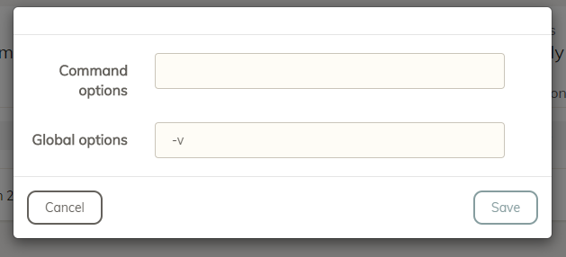
When you enter the option, the command options are at the top and the global options are at the bottom:

image

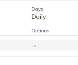
But then in the scheduled job, the command options are on the right and the global options on the left:

image

I guess it would be more intuitive if the global options were on the right and the command options on the left…

2 Likes

I agree it is counter-intuitive, but the command options are more frequently used, that is why they are on the top in the dialog, but when you list them side by side I think it makes more sense to list the global options first in order to be consistent with the actual command line.

Why would this consistency be more important than the consistency within the web-ui?

2 Likes