Reply to post vs reply to topic

This reply is obviously intended as a reply to the topic (raising a new aspect not previously discussed: rendering of graphs), however, it was created as a reply to a specific post, i.e. to another reply that is unrelated to the rendering of graphs).

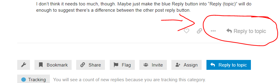
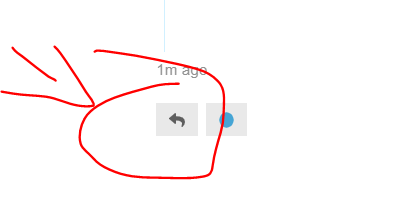
This is a common mistake, if I may call it that (@saspus, forgive me for using your post as an example) and boils down to people not realizing the difference between the reply button at the end of every topic and the reply button under every individual post.

My question here is: how can we avoid this mistake, i.e. how can we make it more evident to users that it matters which button they press and/or make it more likely that they press the right button when replying.

This question has also been discussed on the discourse forum (inconclusively, so far):

I seem to remember another, longer discussion on this but can’t find it now. In any case: while over on meta.discourse.org, decisions about ui changes are made for all discourse instances (and hence tend to be conservative) we are free to just try out things here on our forum. So please tell us why you where or where not aware of the difference between the buttons and what might have helped you notice the difference faster.

If you are wondering what difference it makes, which button you press: the most important is probably who gets notified about your post. If you reply to a specific post, the author of the post gets notified.

Another difference is for readers of the topic, especially late comers who are skimming through the previous discussion. Every post that has been replied to (via the reply-to-post button) has a link to those replies under it, which helps to find them, especially if they’re scattered throughout the topic.

Finally, every post that is a reply to a specific other post, has, in the top right corner, the avatar of the post being replied to and a link to that post, thus facilitating comprehension of the discussion, especially when the replied-to post is not quoted.

4 Likes

Maybe the buttons could be a bit more verbose:

“Reply to this post”
and
“Post your message”

I think having two “replies” is confusing to users.

I knew the difference; it’s mostly intuitive that there’s a difference and what that difference is (the button tooltip kinda tells you so), but agree it could be improved with more verbose text…

I don’t think it needs too much, though. Maybe just make the blue Reply button into “Reply (topic)” will do enough to suggest there’s a difference between the other post reply button.

The highlighted button should have the name Reply to (this?) post, not Reply to topic because right now nothing is changed!

Also: maybe we should hide this third reply button via css (imo there’s no need for 3 reply buttons and i never use it):
image

.topic-timeline > .timeline-footer-controls > .widget-button {
	display: none;
}

Oops, that was not the expected outcome when changing a single field. Reverted back to default.

So there’s no way to only change a single button text. Well balls.

Would something like this not work?

#ember1231 > span {
  display: none;
}
#ember1231:after {
  content: 'Reply to topic';
}

(May have to change the selector as that button id seems a bit arbitrary… am really not an expert; in fact I ruddy hate html/css :wink: )

I think we can figure out the correct css class hierarchy – let’s first wait to see what @Christoph thinks.

No, you can’t use those ember selectors because they are not permanent.

I find it strange that the Topic Reply button cannot be modified by itself via the discourse Ui and would like to (a) double check that this is the case and (b) raise it over on meta, but I currently don’t have time.

2 Likes

Then how about…

.topic-footer-main-buttons > .create > span {
  display: none;
}
.topic-footer-main-buttons > .create:after {
  content: 'Reply to topic';
}
1 Like

I blindly pasted it into the forum’s CSS and it seems to work (at least on mobile). Let me know if the bigger button causes any unintended effects somewhere.

So let’s see if it helps people…

Thanks!

Great that it worked, but allow me to insist: two “replies” confuse the user.

I think the texts of the two buttons must be somehow different.

Then the user will have to learn. It makes complete sense to distinguish between responding to the topic in general and replying to a specific contribution. It’s a bit like the difference in a face-to-face group discussion between addressing a particular individual and addressing the group as a whole.

But as I write this, I’m thinking: maybe calling one a contribution and the other a reply would make sense? - Hm, well, probably not.

Aren’t they now? (I’m just looking at the mobile version)

This is not always easy, when it comes to users. :grin:

Sure, the blue one now has the text “reply to topic”:

image

I was referring to the fact that they are still two “replies”.

I was thinking of something like “reply to this post” and “new post”.

But nevermind, let’s see if the verbose text on the blue button helps users.

1 Like