WebGUI Tray Icon colours?

Hiya,

I don’t think i’ve ever seen the icon anything more than grey or green. Does it change colour otherwise? I’ve had errors and failures but i didn’t see it change colour.

It’d be great if it went red if there was some problem, or yellow if there was a warning of some kind, exclamation mark across it for some reason or other :slight_smile:

2 Likes

Changing the color when there is an error should be easy, but there might be more work, like capturing the actual error that causes the failure and presenting in in a message dialog. I’ll think about it and in the meantime I added it to Roadmap for the web GUI.

Honestly, I’d prefer the opposite – eliminate distractions.

In my opinion the icon should be monochromatic (On macOS preferably vectorized; no gradients) and definitely get rid of animation during backup – that is useless distraction: of course backup tool is expected to backup, the animation does not provide any actionable information.

No color change either (maybe setting it to red could be justified if a critical once in a lifetime error occurs). Notifications should not be communicated via an icon state – there is a dedicated mechanism in the OS to do that – Notifications. I think windows has that too.

Agree with exclamation mark across the thing when user attention is required – that seems subtle enough.

To be completely honest I don’t think it deserves an icon in the first place: The backup tool is not something that user needs to interact with on a daily basis: tray and the menu bar real estate should be reserved to interactive stuff – things you are likely to interact with more than once.

I believe on windows it can be hidden under the pop-out, but on MacOS it stays in the menubar forever, taking space. In fact, I’m even considering to switch from web ui back to using the command line engine under launchd in no small part because of that… Maybe I’m overreacting, but every time it starts spinning there it distracts me from whatever I’m doing.

I see your points. I agree desktop notifications is probably a better way to do it generally - except for something significant perhaps - like the license expiring or something is ‘broken’ with the program.

On my PC for example, on Borg i’ve scripted 3 main levels of desktop notifications:
Green (disappears in i think about 6 seconds) for all good
Yellow (disappears in i think about 12 seconds) for warning - this is usually a temporary thing - like the backup server wasn’t available, or there was a lock on a file, or a permissions issue or such.
Red (doesn’t disappear) for an error or failure. I have to click past this so it doesn’t just vanish without me knowing.

For some reason i personally find desktop notifications in Windows to be annoying, but on Linux i’m fine with them. I seldom use Windows these days - i’m looking at it from my parent’s point of view. I’m not sure they’ve ever clicked on the notification panel or know how to.

So yeah, some way to tell people if something went wrong i think is a good idea. I would expect not everyone would use the emails (which is awesome that it’s baked in btw).

I have a slightly different opinion:

The icon must be present in tray with “default” status to indicate: “ok, backup is active”.

Likewise, the icon should change in some way during backup so that I know: “ok, this increase in disk access is because the backup is running”.

And when there is a problem, I think that the icon should also change (exclamation, red, whatever) to alert me. I agree about OS notifications, but they have a problem: after a while they disappear. If you’re not in front of the computer you may miss a notification. Yes, I know they remain on the list, but it will depend on the user accessing the list.

I agree with towerbr

Even more, I think one of the worst fears of a backup app is a silent failure that goes unnoticed by the user. To avoid that duplicacy should communicate relevant status info without being invasive.

1- Tray Icon:

Icon present: duplicacy is loaded, and active. All good, there is a connected storage
Icon green animated: backing up
Icon red: error. not connected, or backup error.
Icon blue: Checking storage (suggestion)

2-I also think that the con tooltip should display the last error o last successful backup and the next scheduled backup.

3-Right-clicking on the tray menu should give the same information above, as well as access to the corresponding logs (by clicking on the last error o last successful backup.

4-My opinion is that system notifications go unnoticed and are usually ignored.
Backup is important, we need relevant and updated status, that’s why I would always go to the tray.

I would not want any distracting icon animation. Actually the CrashPlan icon on Windows has a little animation, but that is only noticeable, when you look at the icon. Something like that would be ideal.

You can’t have different icon colors depending on the job type that is running. What if both a backup job and a check job are running at the same time?
Also if you have multiple jobs, how long do you keep the red icon?

For that an option to send emails only when an error occurred is the much better option, since it avoids the ambiguities that come along with one icon reporting multiple things. This “send email on error” option has been requested before, so now we’re waiting on the implementation.

I second both points. I don’t need to know when it is backing up. I set the schedule, I know when I want it to be doing what. “Increased disk activity” in a very weak argument: if it impacts disk (it should not, why would it?) enough for me to notice — well I will notice the impact. And if I don’t notice what’s the point in telling me that I could have? this is definition of spam: non-actionable information I did not ask for.

The thing is — once I have setup Duplicacy I don’t want to hear from it ever again. Unless something catastrophic happens that precludes my hourly backups from happening for e.g 3 days. After that an email and maybe tiny gray exclamation mark on the icon is in order. This should be only reserved for critical stuff. So that when always static icon suddenly develops an exclamation mark on it it will be immediately noticeable.

Otherwise I will get desensitized to the always changing icon and stop paying attention in the first place. But more likely uninstall it if it interferes with my productivity long before that.

User experience is very important and invading users desktop with the flashy animations is unacceptable. Especially for a backup program — that is a lowest priority service by its nature. Critical error in low priority service is still low priority. Only users must decide priority, not apps, and definitely not utilities. If some users want that — it should be an opt-in.

It is well put here in the section “Never disrupt the user”: User Interface Principles - Win32 apps | Microsoft Docs. I guess reading the title of the section is enough:) They talk about taskbar flashes. But flashing icon is not different.

As mentioned above — crashPlan is a perfect example. They have polished user experience to death. (Had they done the same with the performance I might have never discovered Duplicacy In the first place— but that’s a different story)

And the best notification is email notification. Acrosync may even consider sending those critical notifications (with consent) even when the email server is not configured (using Acrosync managed Amazon SES account for example). It will cost pennies literally.

And lastly — I don’t remember when last time I had anything flashy on my macs Menu bar. It’s a long row of subtle monochromatic vector icons. These icons are not content I care about. They are utilities and they should not compete for users attention with the actual content. Rotating cube with bells and whistles just does not inspire confidence and looks out of place.

1 Like

I agree, normally an animating tray icon would not be a good choice, though personally the current implementation doesn’t distract me. For a start, my Duplicacy icon is hidden and of the few times I’ve seen it rotate, it’s extremely subtle - changing slightly every second. Then again, you’d be less likely to notice on a 2560 x 1440 monitor - perhaps more on 1080p or smaller.

I do think a different colour or slightly different icon representing basic activity state and perhaps any warnings/error would be preferable to static green. The problem with Duplicacy’s icon is that it’s… green - - very green - to start with. It could be confused with ‘everything is good and OK’.

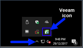
From recent experience, I like Veeam Agent for Windows’ icon:

It’s a subtler colour, has a tiny little circle in the corner which normally shows as a little clock (representing scheduled I guess) and that little circle will change symbol and colour depending on status. A yellow exclamation mark IIRC for warnings, which I had recently when the destination was running low on disk space. And you can see from the pic above, the WIndows Security icon does a very similar thing.

Also, if people don’t want the icon, that should be an option too.

1 Like

To add to this: on Windows you can hide the less important icons into a pop out. On Mac you can’t.

You can [tell an app to] remove the icon altogether (by dragging it away while holding Command key) but the application must play along for this to work. Duplicacy-web doesn’t. So for macOS users using Duplicacy web in its present state means staring at periodically rotating cube in the top of the screen all the time. There is no way around it. At least the cube is not green — it’s gray. Which is nice.

You can disable the tray icon by passing the -no-tray-icon option to the web GUI executable. This is for Windows and macOS. The tray icon isn’t implemented for Linux, mostly because Linux doesn’t have a universal way to show a tray icon.

2 Likes

I agree that animations don’t have to be flashy at all.
And you may just use -no-tray-icon if it really bothers you.
But the goal is to communicate information.
Systems fail in unpredictable ways.

While there is nothing wrong with email on failure, email delivery has multiple points of failure as well.
No mail doesn’t mean no failure.
The tray icon is just another layer, and we can improve on the info displayed by the tray.

Personally, looking at the roadmap I’d rather work on other features like ssh backups for remote computers or a better restore interface with a cached list or a restore based on versions rather than snapshots… :grinning:

Awesome, this might work!

Can this be made a configuration option from within the UI or at least a config file? I’m not sure if it is possible to add command line arguments to apps running at login without writing a script to launch that app. Not a big deal but might be helpful.

Can we get a list of implemented (and not necessarily supported aka use at your own risk) command line options and other settings that could prove to be useful? I understand that this is self contradicting request for documentation of undocumented features, but still :slight_smile: (this no icon option is only mentioned in the release notes and it wasn’t discoverable when I tried to search for things related to the menu bar icon…)

1 Like

There might be some undocumented options, but this option is mentioned in the web GUI user guide (last section).

1 Like

Any updates on this? It would be great to have a monochromatic version of the menu bar icon so it fits in with the rest of Mac OS. Currently, Duplicacy stands out…

Arq for macOS handles this well (it’s still when no jobs are running, and has a slight animation when jobs are running).

I’ve solved it by hiding the icon. This is something that you have to do anyway if you want to run duplicacy with launchd to backup all local users.

Opinion bit:

On the other hand, there is no value in having that icon to being with — it just wastes space in the menu bar. Duplicacy is a background service, I don’t want to interact with it or know about it; when I fails — I prefer an email.

Ironically none of the icons on your screenshot would had a chance to occupy space on my menu bar — including TailScale :slight_smile:

Came to say exactly that!
Capture d’écran 2024-02-14 à 21.13.05
If a monochrome icon is considered and the team needs a vector icon, feel free to ping me.

The icons isn’t very useful right now, but simply indicating when a backup is running and when something fails would be great.

2 Likes