Environment
Duplicacy: v1.1.0
OS: Linux 4.18.7-200.fc28.x86_64 (Fedora v28)
settings.json:
    "listening_address": "0.0.0.0:3875",
    "temporary_directory": "/opt/duplicacy/repositories",
    "log_directory": "/opt/duplicacy/logs"
An ongoing list of bugs I’ve encountered so far from fresh install:
-
Upon startup, I’m asked for an encryption password, this saves correctly. Then I go to Settings and click the “keyboard” icon to enter a new “Administration Password” (since one is not yet set). After saving, the dashboard redirects me to a prompt asking for the just entered “Administration Password”, but it will not accept it, no matter how many times I enter it, correctly. After closing page (or refreshing, can’t remember) I’m prompted now for the encryption password, and then again for the “Administration Password”, this time it accepts the password and I’m able to access the dashboard.
-
Clicking Forum button/link in the sidebar should open in a new window/tab.
-
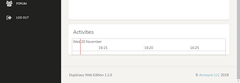
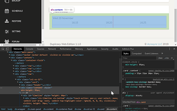
On the dashboard, when no there has been no activity, the border for the graph in the Activities panel needs padding/spacing, at least as much as is on the sides. I see
<div col-xs-12>…<div content>has the correct padding, as well as the next child<div timeline>, but the child div after this,<div vis-timeline vis-bottom>has no padding and a height that extrudes past, and into the padding of the parent div.
If you’re going to hardcode in a height of 70px in the child element, I would recommend setting a min-height in the parent element of at least that plus the padding, so in this case 95px:
-
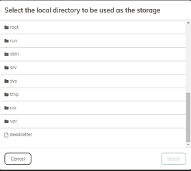
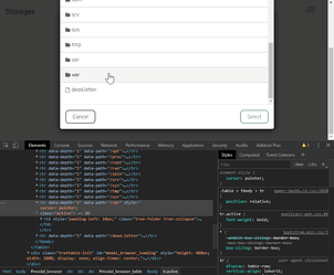
On the Storage page, when browsing for “Disk” storage location, the “Select the local directory to be used as the storage” dialog should explicitly set mouse cursor type so it’s not changing, counter-intuitively, to the “text” type when over a click-able directory location (hard to see in screenshot, but my cursor is at the end of “var”, the last directory):
I recommend, at the least, setting cursor to “default” for the<tr />, but my preference would probably be type “pointer”:
Lastly, it’s not intuitive that the folder icons to the left of the folder name are clickable (this is explicitly stated in the guide which is great!) and it’s not immediately obvious how to expand / drill-down into a folder. I would maybe change the cursor on “mouseover” of the folder icon to “pointer” type (if not already done so for the entire<tr />)
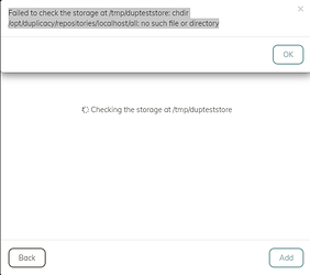
Disk storage selection fails with error on bad permissions
Selecting a Disk directory for storage (/tmp/dupteststore in this case) fails with error:
Failed to check the storage at
/tmp/dupteststore: chdir/opt/duplicacy/repositories/localhost/all: no such file or directory
This was due to incorrect permissions and specifying temporary_directory with value /opt/duplicacy/repositories in settings.json. After /opt/duplicacy set to correct owner, error was resolved.
Maybe a file permissions check with warning/error message here might be nice…
-
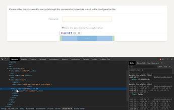
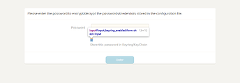
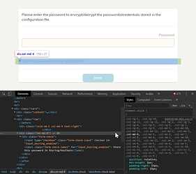
Spacing issues on initial startup config password prompt (and more when narrow view port):
-
It would be great to be able to hit
[enter]key to submit forms instead of having to click the “Enter” button, especially single field forms like password prompts. -
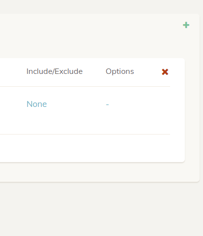
On Backup page, it’s pretty hard to see/understand the Include/Exclude and Options fields are clickable. The first is color and hovering changes the color so that’s something, although the coloring didn’t stand out visually for me and I didn’t notice it at first. The little “-” dash/hyphen under “Options” is all but invisible. I’d recommend some kind of icon, shading, or background coloring to hint that these are clickable.
-
I have to manually run check job after any backup to see updated storage stats. This turns into a chore for me: anytime I want to pull up the web GUI, I have to go run the check storage job first. I would be great of backup jobs automatically ran check storage afterword, delivered a summary/stats of the backup directly to the web GUI db (basically just as the check job does), or even a configuration option to “autorun check job” after backups.
-
When deleting my initial backup configuration, I got a warning that the backup config couldn’t be deleted because Include/Exclude file couldn’t be found in
.duplicacy-web/.... This caused the GUI to not finish clearing the backup config from my screen, so I tried to delete the backup config again and now received an error that the backup config didn’t exist. After refreshing the page, I see the backup configuration had already been deleted. -
On the Schedule page, it would be nice to have a way to edit a “task” in a schedule instead of having to delete and re-add it.

