Edit pattern list in a text editor

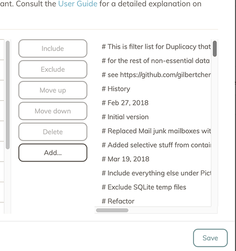
Right now I have to jump through hoops to edit my (if only slightly over-engineered) filter list – moving things around with move up/move down takes ages and wears out my mouse buttons, and the full text still does not fit in the preview window there; selection also behaves weird.

All I’m wishing for here is an Edit… button that would open the filter list in a plain editable text field. That’s all. for small edits I would do that right thtere, and for more complicated stuff – I’d copy text somewhere else.

Right now I have to guess where is the filter list on disk and edit it with third party tool. Not very user friendly.

Alternatives – Export/Import list. Or Copy/Paste to/from the keyboard. etc…

4 Likes

A big 'old text box - in addition to the line item UI - would make a whole lot of sense.

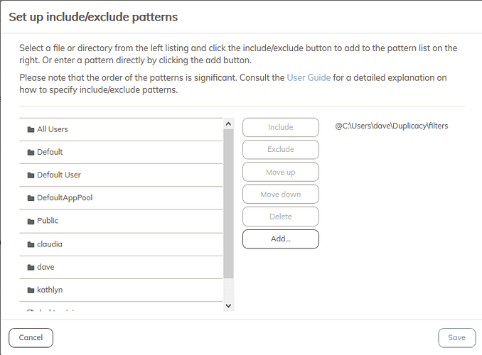
Using imports to keep filter definitions in a location that you control, can backup, and easily edit is a workaround for the lack of filter editing in the web UI.

3 Likes

Maybe I should change Add... to Edit... so you can edit the entire filters file directly. Add... seems to be of limited use.

3 Likes

yes. That would be awesome. Add adds to the end, and is usually followed by 200 mouse clicks to move that item where it needs to be. And the list does not scroll to follow the selection so its 10 clicks, scroll the list, 10 clicks, scroll the list, repeat… ah! missed the spot, few more clicks to move down :slight_smile:

In the mean time I followed @dkremer’s recommendation above – and wow how awesome it is (maybe I’m too paranoid but my Duplicacy filters file is under git source control…). I did need to click 200 times to delete each line of the filters file though :slight_smile:

I missed the support for indirect filter lists somehow :slight_smile:

Side note – I think (and I know a lot of people will disagree) but duplicacy should collect telemetry on usage patterns to provide you some feedback on how people use the software to identify awkward workflow or have a better idea on which use cases to optimize, or perhaps what features required better discoverability and interface tweaks for affordability.

For example, this would help you hit at the problem with Add button – since 200 mouse clicks would be strongly correlated with click on add button – that would stick out as rather unusual pattern.

1 Like

Yes, definitely. When I set up Duplicacy on my sister’s MacBook Air 2014, the filter UI cut the filter file/path names on the right off after a certain number of characters, so I actually couldn’t validate the correctness of my input. An option to edit the whole filter list (even if only to validate filters would be great, much more useful than just adding a single line.

And if you could ensure that there is enough space to display the entire filter line that would be even greater. :smiley: