Restore UI Options - perhaps explicit selectors instead of an unforgiving edit field?

I appreciate the ability to just type in the destination, in addition to having a button for browsing for a folder (Which I’d rather use standard OS file dialog – but that’s for a different topic)

However the same logic does not really work well with Options field.

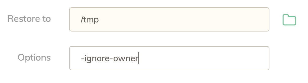
From personal experience, my most frequent restore are into /tmp and most frequent options are -ignore-owner, because that would fail otherwise – users UUIDs are different.

However there is no easy way for me as a UI user to figure that out. All I see is the restore failure messages. I have to deduce from logs that the actual failure is chown related and then run command line duplicacy to figure out if there is a flag that can help with that. Turns out there is, -ignore-owner (while I’d prefer --ignore-owner but since I can copy and paste it its’ fine. This requires quite a bit of knowledge and intuition about how duplicacy works and venturing into CLI land, which users that prefer GUI likely are not looking forward to.

So why not save users from frustration and implement checkboxes for the existing options? There is finite amount of relevant ones:

   -hash 			detect file differences by hash (rather than size and timestamp)
   -overwrite 		overwrite existing files in the repository
   -delete 			delete files not in the snapshot
   -ignore-owner 		do not set the original uid/gid on restored files
   -threads <n>		number of downloading threads
   -limit-rate <kB/s>	the maximum download rate (in kilobytes/sec)

I’d check the “ignore owner” checkbox and be on my merry way :slight_smile:

7 Likes

Totally offtopic me but this ^^^^^^^!

1 Like

I agree.

I’ve only just started playing around with the Web Edition and one of the things that struck me was inconsistent use of options. It’s nice that I can specify -vss for one of my backups but ideally, every single CLI option should be reflected with a GUI element.

For example - adding a prune job shows you tick-boxes for retention policy AND an Options field for more CLI options. That’s great, but once you add the job, it shows those options in CLI format and you can only edit those options as CLI options, you can’t go back to tick-boxes. (Also, having both could lead to inconsistencies when both types are used - especially as -prune's have to be in a specific order.)

I can understand why this is done for prune - you might want more (or less) than 3 retention periods, but you could still do this with the GUI. i.e. have +/- elements for adding more rows (perhaps up to 5) and a tick-box for “Delete snapshots older than” just in case you don’t want this option.

Then, you wouldn’t need to tinker with CLI flags at all, and so I feel perhaps the GUI should hide such CLI option format entirely.

Re OS file dialog - I kinda like the web styling to be honest. (Although I will say the line height of the folder browser is way too heigh, imo.) However, I found that I had to manually type the UNC path as the web folder browser can’t see my network shares without a mapped drive letter (which I don’t use).

On a related topic, it would be nice when creating a new backup schedule that it would copy across the options (e.g. -vss) from the backups I set up before. It feels a little unintuitive that you have to re-specify the same options when creating a schedule from them.

I agree every CLI option should have a corresponding GUI element, but I’ll leave this to a later version after all essential features have been implemented.

7 Likes

Moving this to the #feature request category, and tagging it #planned!

1 Like

If this is #planned, is this something that should be added to the roadmap for the web GUI?